NASA Engineers have just finished applying the final coat of clear over the beloved “worm” logo on the rocket boosters of the Artemis II, which marks the return of the bold red letters that best embody the National Aeronautics and Space Administration. The worm logo has come crawling back, according to Space, bringing its retro charm to the upcoming lunar mission that will send humans back to the moon for the first time in over 50 years.
The Artemis II mission is scheduled to put people back into lunar orbit in 2025, while the Artemis III will see humans return to the lunar surface no earlier than 2026, per Space. America’s manned mission to the moon is the marquee news, but the real news here is that the logo we most associate with NASA is called the “worm.” Quick! Put on some Beastie Boys, y’all, because NASA is once again doing the worm.
Truly, the modernist logo is the best one the agency has ever used. I would go as far as to say the uncomplicated sigil is one of the most recognizable logos ever made, and the best to represent mankind’s interplanetary ambitions. I just had no idea until today that it’s called the worm logo, and dates back to the 1970s, conceived of by designer Richard Danne.
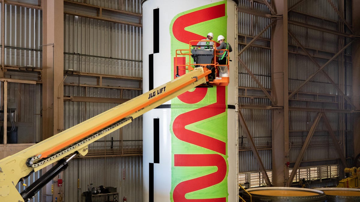
The worm is now back for Artemis II, where it will adorn the massive SLS rocket’s boosters and the Orion’s crew module, according to NASA:
Art and science merge as teams add the NASA “worm” logo on the SLS (Space Launch System) solid rocket boosters and the Orion spacecraft’s crew module adapter at NASA’s Kennedy Space Center in Florida for the agency’s Artemis II mission.
The iconic logo was introduced in 1975 by the firm of Danne & Blackburn as a modern emblem for the agency. It emerged from a nearly 30-year retirement in 2020 for limited use on select missions and products.
NASA’s Exploration Ground Systems and prime contractor Jacobs began painting the red logotype onto the segments that form the Moon rocket’s two solid rocket boosters Jan. 22. To do so, crews used a laser projector to first mark off the location of the logo with tape, then applied two coats of paint and finished by adding several coats of clear primer. Each letter of the worm logo measures approximately 6 feet and 10 inches in height and altogether, stretches 25 feet from end to end, or a little less than the length of one of the rocket’s booster motor segments.
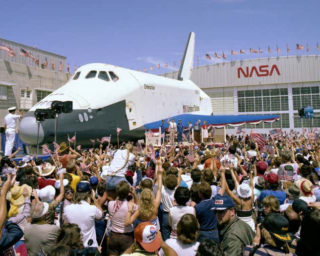
The worm logo replaced the so-called “meatball” logo, which is the first logo used by the agency and the original one NASA spacecraft bore. This is further proof that NASA uses a ridiculous naming scheme for its logos, and their story was detailed by Design Week in 2021, shortly after the worm logo reappeared after nearly a thirty-year hiatus:
The NASA Worm was born as a result of the US Federal Design Improvement Program – an initiative prompted by then-President Richard Nixon and the National Endowment for the Arts (NEA).
Under the scheme, more than 45 federal agencies had their identities evaluated and redesigned, including the National Park Service, the Environmental Protection Agency and the US Postal Service.
[…]
The outgoing logo was the red, white and blue NASA insignia designed by James Modarelli just one year after the agency’s inception in 1958.
Affectionately referred to as the “meatball”, the logo was not capable of dealing with the renewed attention NASA was getting post-moon landing, Blackburn once said.
Blackburn’s studio partner Danne added to this, reflecting in an interview with Creative Review: “The meatball was complicated, hard to reproduce and laden with Buck Rogers imagery – clearly it was born out of the classic airman syndrome where hype and fantasy dominated over logic and reality.”
“Our [proposed] logotype was quite the opposite: it was clean, progressive, could be read from a mile away, and was easy to use in all mediums,” he added.
[…]
“Their whole business is the future and getting us there,” he said of the challenge in the 2016 documentary Blackburn, calling it one of the most difficult he encountered during his career.
According to the logo’s history, I suppose it’s fitting that we thank Richard Nixon for prompting the federal government’s stylistic overhaul that gave us the worm logo, which will soon go back to space and usher our return to the moon.