Over the past decade or so, infotainment has become increasingly important inside cars. Hell, if an infotainment system is bad enough, it may keep a buyer out of the car altogether. In more recent years, some companies like BMW and Stellantis have figured out how to make infotainment screens and the information they provide actually work. Unfortunately, not all infotainment systems are created equally, and that’s what leads us to today’s question.
I want to know what the worst information system you’ve ever used is. Lord knows there are some absolute stinkers out there. It can be from any automaker era. Back in the early to mid-2000s, there were tons of nearly unusable infotainment systems. However, even up into today not all of them are great… looking at you Land Rover.
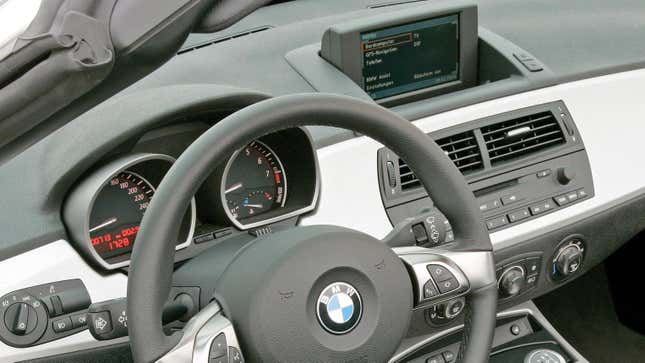
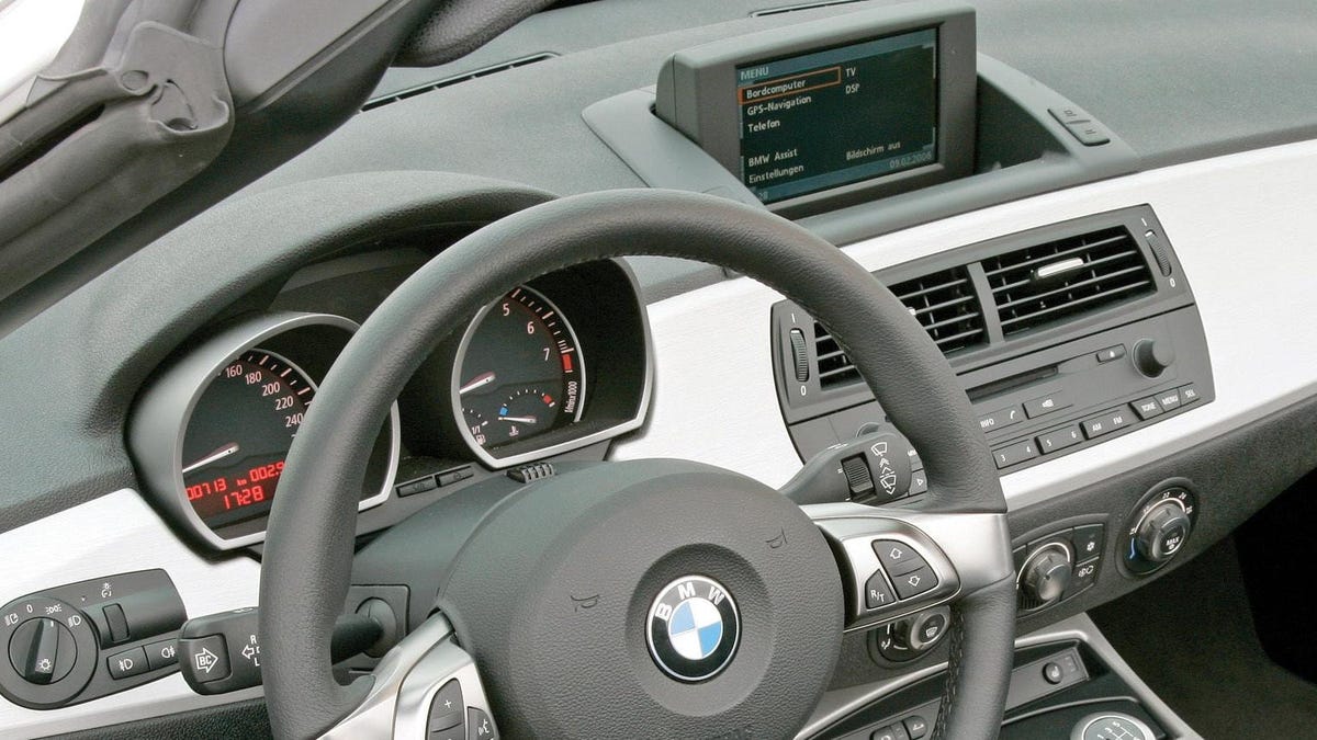
But, if you ask me – which you didn’t – the worst infotainment system ever fitted to a car is unfortunately the one fitted to my 2007 BMW Z4. That means I’ve got to use it just about every time I was to drive the damn thing. It’s clunky, the graphics are terrible, it has limited usability and it cannot be removed from the car because it’s got one of those dumbass pop-up screens. However, none of those things are the worst part of the system, oh no. The worst part is the little know (similar to the iDrive knob many have come to know and love) operates the wrong way. Want to go right on a menu? Scroll left. Want to go left? Scroll right. It’s absolutely miserable and stupid. Other than that, I love the car. I really wanted to find one without the scene, but beggars can’t be choosers.
Anyway, drop down below and let us know what the worst infotainment system you’ve ever had the misfortune to use is. As always, I’ll be awarding bonus points (redeemable at your local Six Flags) if you tell me why you hate it so much.

