We have all heard the idiom “Never judge a book by its cover,” but the opposite can be true for cars. Any new model could be a spec sheet hero, but the first impression that anyone will have is through photos. Appearances can paint a picture of how the public perceives vehicles, from what people think each car can do to whether they want to buy a car.
What car design aged fastest? I’m talking ‘milk left out in the middle of Death Valley’ fast. Automakers use styling cues to make their cars distinct from their competitors in the marketplace and create connections between all the cars in their lineup. However, some cars are immediately fixed at a specific time from the moment they hit showrooms.
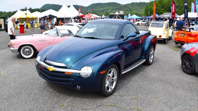
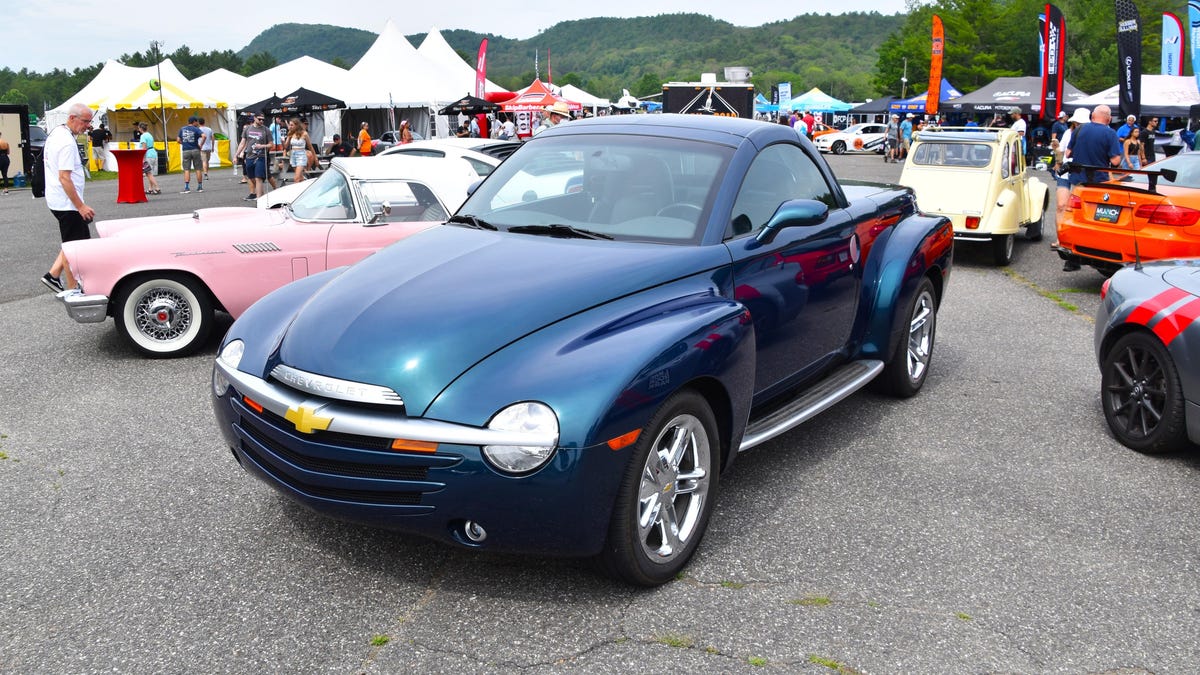
For me, the Chevrolet SSR stands out for all the wrong reasons. The convertible pickup was styled to look like a late 1940s Chevy truck. The SSR is simply too rounded out, and the windshield isn’t sloped steeply enough to mark it as a truck. The fenders are far too gentle and blended into the body too much. It’s not the retro look, but completely forgoing contemporary pickup cues. There are plenty of examples of retro styling hitting all the right notes. Recent iterations of American muscle cars, such as the Camaro, Challenger, and Mustang, come to mind as good examples.
Please don’t hesitate to share what car designs aged like milk in your eyes in the comments below.

